Mastering Dashboard Design
Whether you're a seasoned data analyst or an emerging enthusiast, crafting an eye-catching dashboard requires attention to detail and adherence to best practices.
In today's data-driven world, dashboards serve as fundamental tools for communicating intricate data stories effectively. The following is a handy checklist that I recommend you to consider when designing your next dashboard.
Photo by Jeremy Bishop on Unsplash
1. Understand the dashboard types
Dashboards come in various forms, each tailored to specific user needs and goals. By understanding the different types, you can align your design with its purpose:
Strategic Dashboards: Designed for high-level business metrics and long-term trends. These dashboards cater to C-suite executives, and they normallu require minimal interactivity.
Tactical Dashboards: Offer detailed insights relevant to specific teams or departments. They contain numerous metrics and plots but still maintain low interactivity, targeting team leads or managers.
Operational Dashboards: Dive deep into granular details concerning specific business problems. They include high interactivity and cater to operational analysts.
2. Know your target
Before diving into design, it's essential to understand your audience's preferences and requirements by asking:
What questions are they seeking answers to?
In which flow is your audience involved?
How much technical knowledge do they have?
How frequently will they check the dashboard?
3. Design with a narrative in mind
Storytelling is key, so craft a cohesive narrative within your dashboard to guide users seamlessly through the information shown:
Begin with high-level metrics and gradually dive into specifics.
Organize content logically using panes or tabs.
Use color and text to drive the attention effectively.
4. Guiding with text and color
Like I said, guide your audience's focus and set a visual hierarchy by using text and color to highlight the right items:
Emphasize key elements with bright colors, big text, or bold formatting.
Conversely, de-emphasize less critical components using muted colors and smaller text.
5. Reduce the cognitive load
Simplify the experience, optimize the performance of your dashboard and enhance the data consumption by minimizing cognitive load:
Maintain consistency in design elements throughout the dashboard.
Employ vertical layouts to facilitate natural scrolling.
Choose easily readable fonts and format numbers.
6. Use the right layout
Select a layout that aligns with your content and user preferences:
Single-column layouts offer simplicity and ease of navigation.
Multi-column and grid layouts enable efficient organization of complex data.
Report layouts mimic traditional reports, which is ideal for structured presentations.
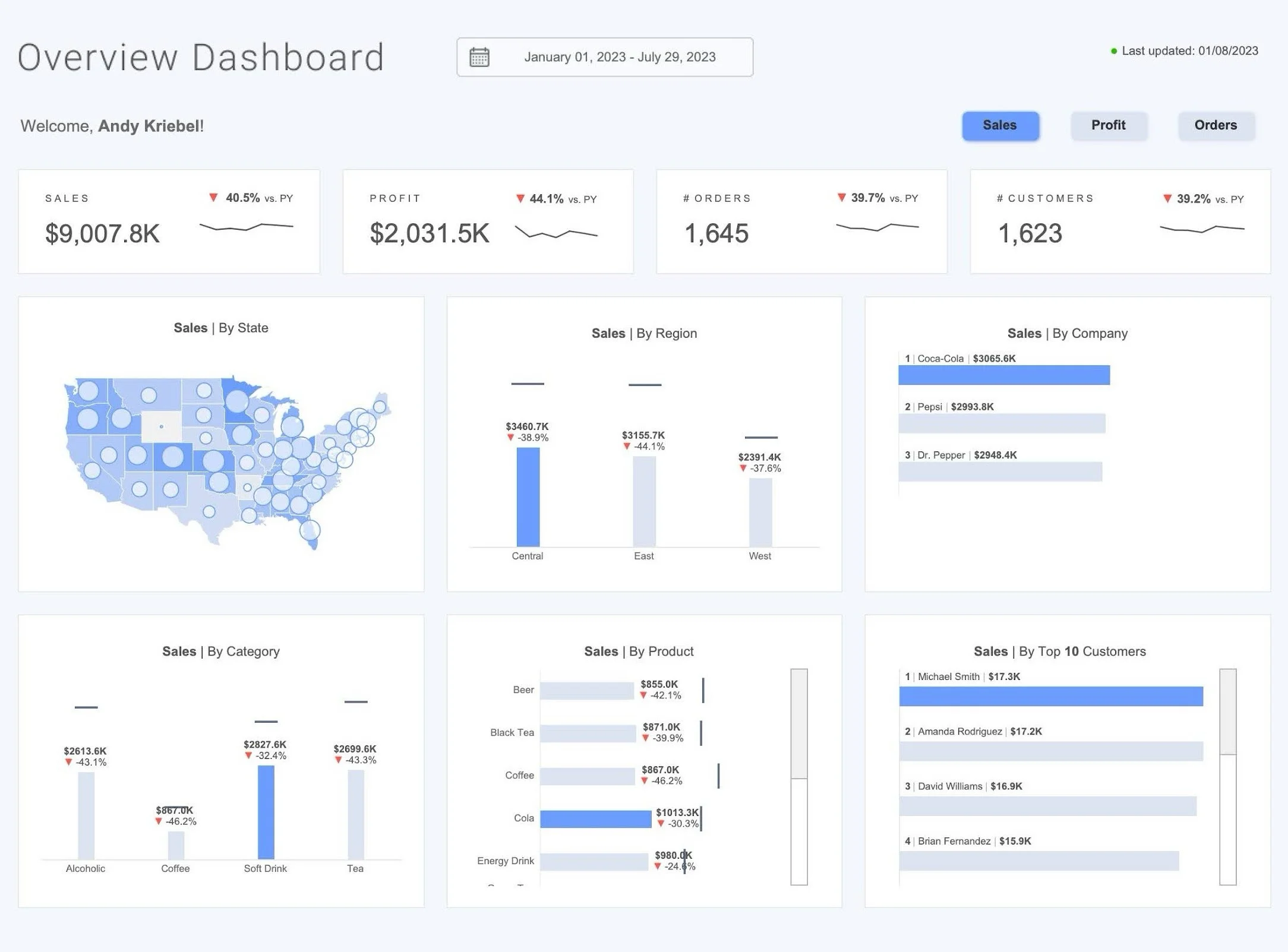
Superstore Dashboard by Priya Padham
7. Provide context for visualizations
Enhance comprehension by contextualizing complex visualizations with the following:
Label axes and provide titles for clarity.
Incorporate subtitles to offer additional insights. Tooltips are useful for interactive dashboards as well.
Highlight important data points and adjust font size accordingly.
To summarize, a dashboard's quality and effectiveness don't depend on the tool used, they depend on the people who make it. If you follow these rules and use easy-to-use designs, you can make dashboards that people like and provide useful information at a time; because a well-designed dashboard isn't just a tool, but the key to elevating your product experience in the modern data-saturated world.